Showing posts with label Ad review. Show all posts

Friday, February 20, 2009

Good concept makes good Ads


You would think surf/snow companies would come up with creative ads that serves a purpose, providing a value other than just showing the product... let's be honest we don't buy stuffs only based on performance, and I think a lot of companies have done very poorly.

Electric Visual has a great concept, to carry emotion, personality, and style via animals.It is simple, it is beyond words and it also leaves room for people to have their own interpretation of the products. I also enjoy the fact the riders are mimicking the animals.

By using this concept and a wide variety of animals, they can reach a wider audience but still keep their identity by being creative and unique.


Tuesday, December 23, 2008

Billabong. Vs RipCurl


I guess creativity is running dry in major surf companies. I am aware that Fluorescent is in full power, I have seen it for the past two year on shades, on clothes and now on print ads. I would like to see a bit more originality, specially when you have the marketing Rip Curl or Billabong's marketing budget.

Next time, I may even see fluo while grocery shopping??

Monday, December 22, 2008

When an image is better than words


I really enjoy seeing good ads, nothing better than a picture that says it all.

I usually prefer clean pictures, that are simple and to the point. When it gets overloaded with color, arts,etc..it just get confusing and also I feel they just try too hard.

No need for me to explain the Komunity ads..it speaks for itself.

Monday, December 15, 2008

When Butt matters....


I am gonna be honest, to have some good lookin' chicks in bikini in a surf mag is quite pleasing.
Reef has became synonymous with women curves (mostly backside view). I am still wondering how butt and sandals are related but it sure created a buzz in the teenager world.

Other companies (mostly startup) are trying as well, but it just feels like a marketing tool and it doesn't feel right.

So why Reef can get away with it, it's because they were N 1 in the customer mind, it is part of the brand spirit and that is why others feel like copycats.

Friday, December 12, 2008

Von Zipper Vs. Smith Optics


So yesterday I was talking about interruption marketing. I have nothing against ad, my problem is that some companies out there don't use the ad to its full potential.

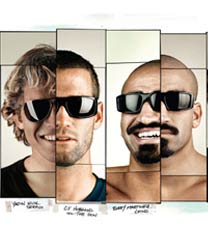
Let's take the Ad from Von Zipper and compare a similar product from Smith Optics.

The ad from Smith says "the best team, the best eyewear"...Alright they sponsor Bobby, CJ, Yadin but if you look at the best team, I would think Donovan, Andy, Taj, and Parko are way better so to the consumer it is such a cheezy thing to say "best team" in what??? does that make Smith the "best eyewear"?

If it was only about product, I would buy shades at Walmart. But by wearing a brand, I am communicating a brand spirit, I am saying something by wearing Von Zipper instead of Electric,etc...So the ad's goal is to communicate this spirit.

VZ's ad is really creative, it's about fun, unique and original. It is exactly what you want to feel when you wear shades. Nonetheless it should not be creative for the fun of it, you need to have brand consistency and how you carry your message.

Monday, December 8, 2008

Sanuk: the mammoth


I think everyone who has worked in a creative department loves to design new ads, new stories, a new way to sell a product: that is the fun part of our job. However a team should be aware at working a brand consistency.

I really like the latest ad from Sanuk, it's light, funny and it is simply different from all the ads you see in a mag. I would say it pictures pretty well the brand: ugly shoes that are actually pretty comfortable.

However I haven't found the slogan resonating with the ad: " highly evolved style with prehistoric comfort".
In my opinion prehistoric means rough, rocky , anything but comfort and looking at those shoes and how there are pictured through the ad, I would describe them as prehistoric but damn comfortable.
So by simply switching words, the ad could get its full potential: "Prehistoric style with highly evolved comfort".

With that said, Sanuk is counteracting all those surf companies that are saying I am the definition of style...here they could position themselves as I don't give a damn about style, we are all about comfort.

Thursday, December 4, 2008

Billabong Ad: the Prism


On average a consumer will see about 3000 marketing messages a day. Print ad, TV commercials, Banners,etc.. are what I call Interruption Marketing. The goal is to stop the consumer for a brief instant.

Interruption doesn't work no more, I bet you that the following day, you may only remember 3-4 ads that have grasped your attention. Which lead me to write this blog: surf mag are mostly ads, there are few good ones like Insight, Community and then there are terrible ones.

I am gonna talk about the Billabong Prism ad.
First of all it seems Andy Irons got giardia because he sure looks like he gonna sh*t his pant. Then they use this fluo color that have seen over and over the past season. By the end of the mag I thought this ad is the worst I have seen in a long time so I decided to look at it again and saw that they tried to portray like the view from a Prism. Clever that's the name of the boardshort...Not.

When your company is named Billabong, I think you can do better than that. Sometimes I feel like they put ads just for the sake of it. At least some brands are trying harder.